Saturday, 28 April 2012

Cotton Threads- Whitworth Art Gallery


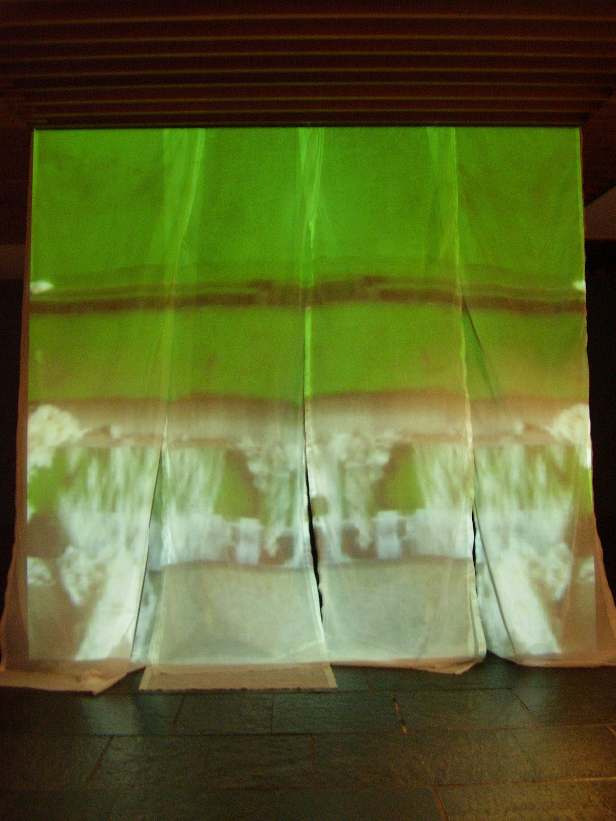
During a recent visit to Manchester I visited the exhibition 'Cotton Threads' showing at the city's Whitworth Art Gallery. For me, one of the highlights was Liz Rideal's multimedia installation 'Drop Sari'.


The piece consisted of four lengths of fabric, which were moving slowly in a gentle breeze, onto which a series of film & images were projected. The images included fabric designs & sequences depicting the cotton manufacturing process in India.


This is the information about the piece given by the gallery:

Examining 'The Textile Manufactures of India', sample books of Indian textiles assembled in 1866 to demonstrate to British manufacturers Indian preferences for their clothing, was the catalyst for Liz Rideal's work in this exhibition and provided the opening animation sequence of the 'Drop Sari' film. Her work transforms familiar and commonplace objects into strange and seductive imagery, with drapery frequently performing as the subject of a piece.


Friday, 27 April 2012

Homemade paint

Since I wrote the post about Seraphine, I have made two attempts to make my own paints.


The photo above shows red onion skins bubbling in a pan. The water became a deep ruby colour & I was so excited to try using it.


My experiment, even after two dips in the mixture, did not live up to the deep red it promised & gave a very disappointing result. It had the appearance of a manilla envelope!

For my second brew, I boiled up skin from the less exotic brown onion. This turned the water a golden amber colour & held a depth of colour that the first concotion had lacked. I used this first homemade paint for the eyes of the cat below.


The drawing is the first sketch for a character from a novel that I am basing some work on. I used a British Blue for the model & was quite pleased with the resulting eye colour.

Friday, 20 April 2012

Sketchbook Project

I met my friend, cococita, a talented photographer, through an online course. She has a keen eye for colour & composition. When she asked, I was only too pleased to give some feedback on a sketchbook she had made. The work was part of  The Sketchbook Project 2012 .


Participants were asked to select a theme for their sketchbook. The one chosen was 'The first ever ...' and the sketchbook is entitled 'The Beauty of Simplicity'.


The sketchbook incorporates a number of different themes: accessories/clothes, pattern/graphics, bottles/pots & flowers. They are connected by the clean linear nature of the drawing & balanced presentation


I noticed the vase of white tulips in one of the photos with the sketchbook drawing of them and liked the way the shadows fell on the page, echoing the shapes. 


The artist seems to be interested in the relationship between objects & the space they take up.


I love the outline drawings of the vases & the way that real objects have beenplaced on top of & then photographed- the interplay between the real object & a representation of it. The work of the British artist, Ben Nicholson , explores similar themes. Some of his work was concerned with outlines & overlapping shapes of bottles & pots.


The work shows a keen eye for design & balance. 'The Beauty of Simplicity' was also an interesting title & was reflected it well in the pages. I really like the use of  collage combined with drawing (this is something I am also exploring in my own work) & enjoyed this aspect of the work. 

To view the entire sketchbook click here, here and here.

This sketchbook was produced as part of The Sketchbook Project http://www.arthousecoop.com/projects/sketchbookproject

Registration is now open for the 2013 Sketchbook Project by clicking here.

Thursday, 19 April 2012

Seraphine Louis

 View the updated version of this page by clicking here.

What would you do if you lived in a time or location where art materials were not readily available? I have spent some time considering this question & my solutions included burning wood to make charcoal, creating sculptures from natural/found materials & using natural substances to make my own pigments. One artist took this idea to the extreme.


Seraphine Louis was a French domestic and, unbeknown to many of her employers, a committed & driven artist. Due to her impoverished life, she could not afford to buy commercially produced materials. Her ingenious solution was to gather everyday substances, such as wine, soot & oil & transform them into vivid pigments which she used to depict her natural surroundings.


Yolande Moreau plays Seraphine in Martin Provost's 2008 film of the same title. This charming & gentle film reveals the artist's delight in the beauty of her natural surroundings. She is depicted as both grounded by her life of domestic work yet somewhat detached from the society in which she lives by her compulsion to paint.
The film centres on the relationship between Seraphine & Willhelm Uhde. Uhde was both an  art dealer & collector who had exhibited Picasso as early as 1908. He organised the first exhibition of naive art in Paris, which included work by Rousseau alongside those of Seraphine Louis & others.

Seraphine believed that the angels were commanding her to paint. One day she said that the angels had gone and she never painted again. Seraphine developed mental health difficulties & ended her days in an institution.

The film deservedly won seven French academy awards when it was released in 2008.

If you would like to find out more info about the film, the image above is a link to the film on Amazon.

Discovering Watercolour is an exciting new course for those wanting to explore this vibrant & inspiring medium - click here for more info.

Sunday, 25 March 2012

Flower journal

I have been using the journal that I made to make quick sketches & watercolours. I really love the way the pages are slightly different sizes & their softly torn edges.


I used a Berol water-soluble pen for sketching, this enables me to soften some of the lines later on using a brush & plain water.


The sketch below was also sketched using a water-soluble pen & then watercolour was added.


By the way, the reason the pages are different sizes is because I didn't fold the paper very accurately - but, I think it gives my journal character!

Tuesday, 20 March 2012

Experimenting

I recently acquired a box of Brusho, it comes in tiny pots & is a very strong powdered pigment.


These are my first experiments.

I love the way it can be diluted to create an ink-like intensity or can be lightly scattered on wet paper (bottom left) to create a lighter effect. It is quite different to working with watercolour & once dry, cannot be reactivated.

Friday, 9 March 2012

Creative games

I don't often find that I am stuck for ideas, rather that the opposite it true. I often feel that I have too many ideas vying for my attention & end up spending too much time deciding where to start, rather than creating.

However, I think I have found a way around this dilema.

I noticed how much I really enjoyed attending workshops, where the activity had been planned for me; experimental drawing, working from a life model. I think this is because my day job is as an art tutor & it's so liberating for me to just arrive at a workshop & be surprised by the activities presented.
I toyed with the idea of planning such sessions for myself....... but was then back to having to make a decision about which activity to start with.

And then I thought 'what if I could make this into a game?'
How would the game work?
What form would it take?
What would be the rules?
Would I be able to get away with cheating?

I quickly wrote a couple of words on a small piece of paper for each of my potential projects, folded them (without looking at them in case I was tempted to cheat!) & dropped them into a pot.

I then thought about the rules of the game.
The Rules
1. Only one piece of paper can be drawn from the pot at a time.
2. The topic cannot be discarded or returned to the pot.
3. Another paper can only be drawn from the pot once the preceding project has been completed.

I'll let you know how it goes...........